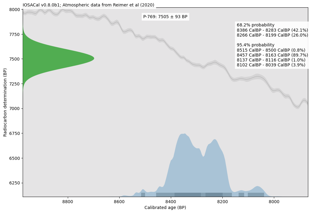
STOP OCCUPATION 🍉 S. Costa @steko@scholar.social · activity timestamp yesterday Experimenting with colors ... #Archeology #Radiocarbon #Python #OpenScience #Matplotlib #ClimateScience #Prehistory Read more Read less Translate alt A scientific plot with data about calibration of a radiocarbon date. The background is light grey and there is a Gaussian normal curve plotted in green on the left side, rotated 90 degrees clockwise, a grey curve that goes up and down through the entire plot area, and a solid blue area in the lower left that shows the calibrated age. In the top right there is a textual summary of the calibrated age. A scientific plot with data about calibration of a radiocarbon date. The background is light grey and there is a Gaussian normal curve plotted in green on the left side, rotated 90 degrees clockwise, a grey curve that goes up and down through the entire plot area, and a solid blue area in the lower left that shows the calibrated age. In the top right there is a textual summary of the calibrated age. Reply Boost Quote You cannot quote this post Like More actions Copy link Flag this post Block
alt A scientific plot with data about calibration of a radiocarbon date. The background is light grey and there is a Gaussian normal curve plotted in green on the left side, rotated 90 degrees clockwise, a grey curve that goes up and down through the entire plot area, and a solid blue area in the lower left that shows the calibrated age. In the top right there is a textual summary of the calibrated age. A scientific plot with data about calibration of a radiocarbon date. The background is light grey and there is a Gaussian normal curve plotted in green on the left side, rotated 90 degrees clockwise, a grey curve that goes up and down through the entire plot area, and a solid blue area in the lower left that shows the calibrated age. In the top right there is a textual summary of the calibrated age.